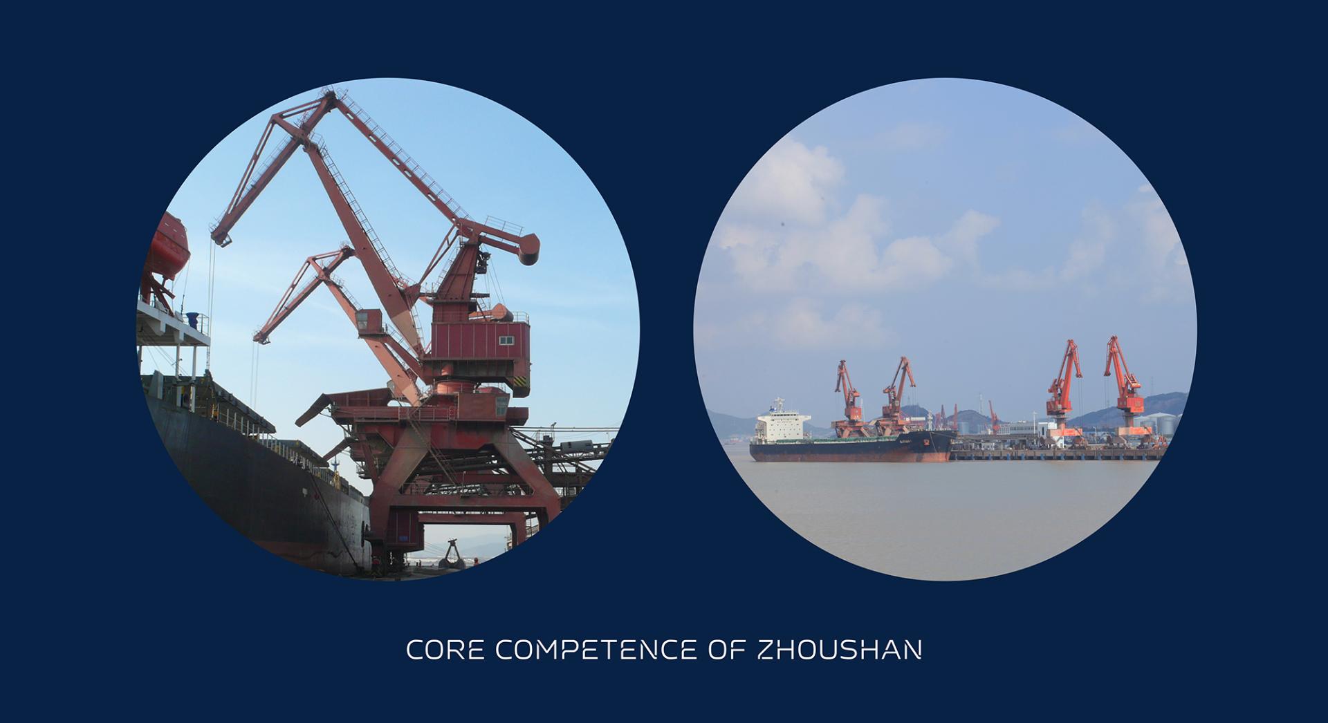
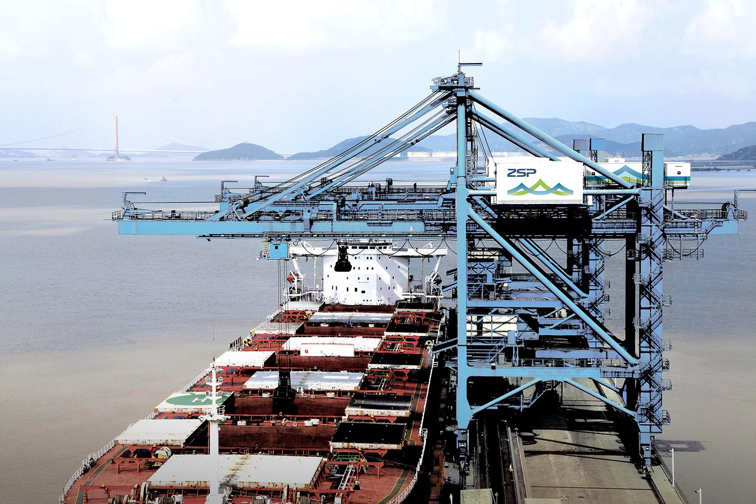
舟山港作为中国东部国际航运中心核心枢纽和上海-宁波-舟山组合港的主组成部分,以港口码头产业为核心业务,以港航服务产业、物流延伸产业和商务开发为支撑的多元化发展的现代综合港口物流服务商,是舟山市经济社会发展和对外开放的重要依托
目的
舟山群岛作为国家级新区正式写入全国十二五规划,发展瞄准世界一流港口城市,并拉动整个长江流域经济。因此,舟山港亦迎来一次重大的机遇与挑战,企业也从“国内运输需求”转向“全球化港口竞争”。舟山港需要一个作为舟山的城市名片与更具国际化的品牌形象。
方法
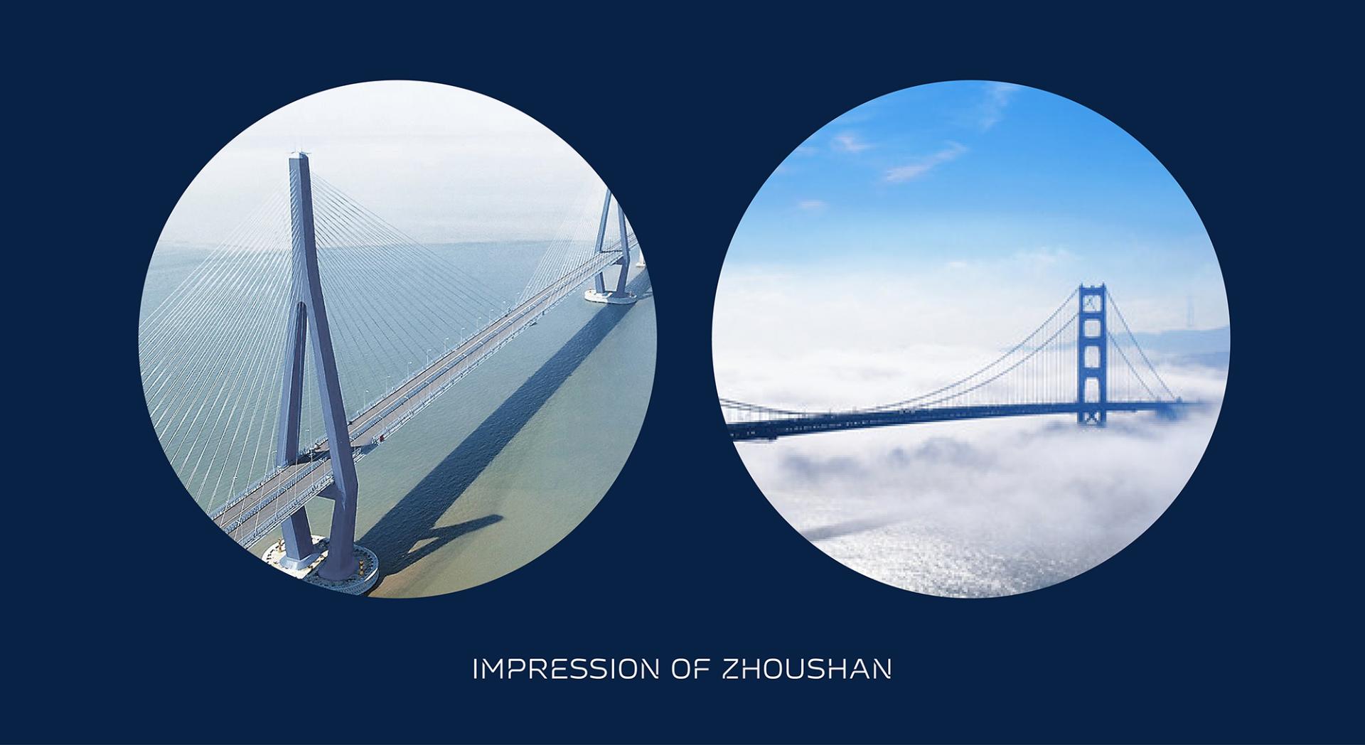
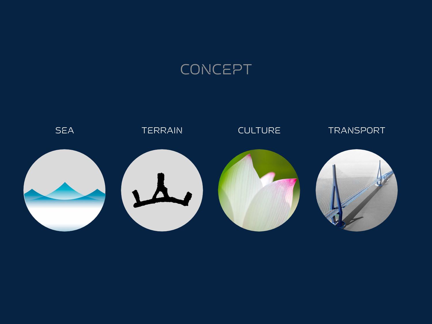
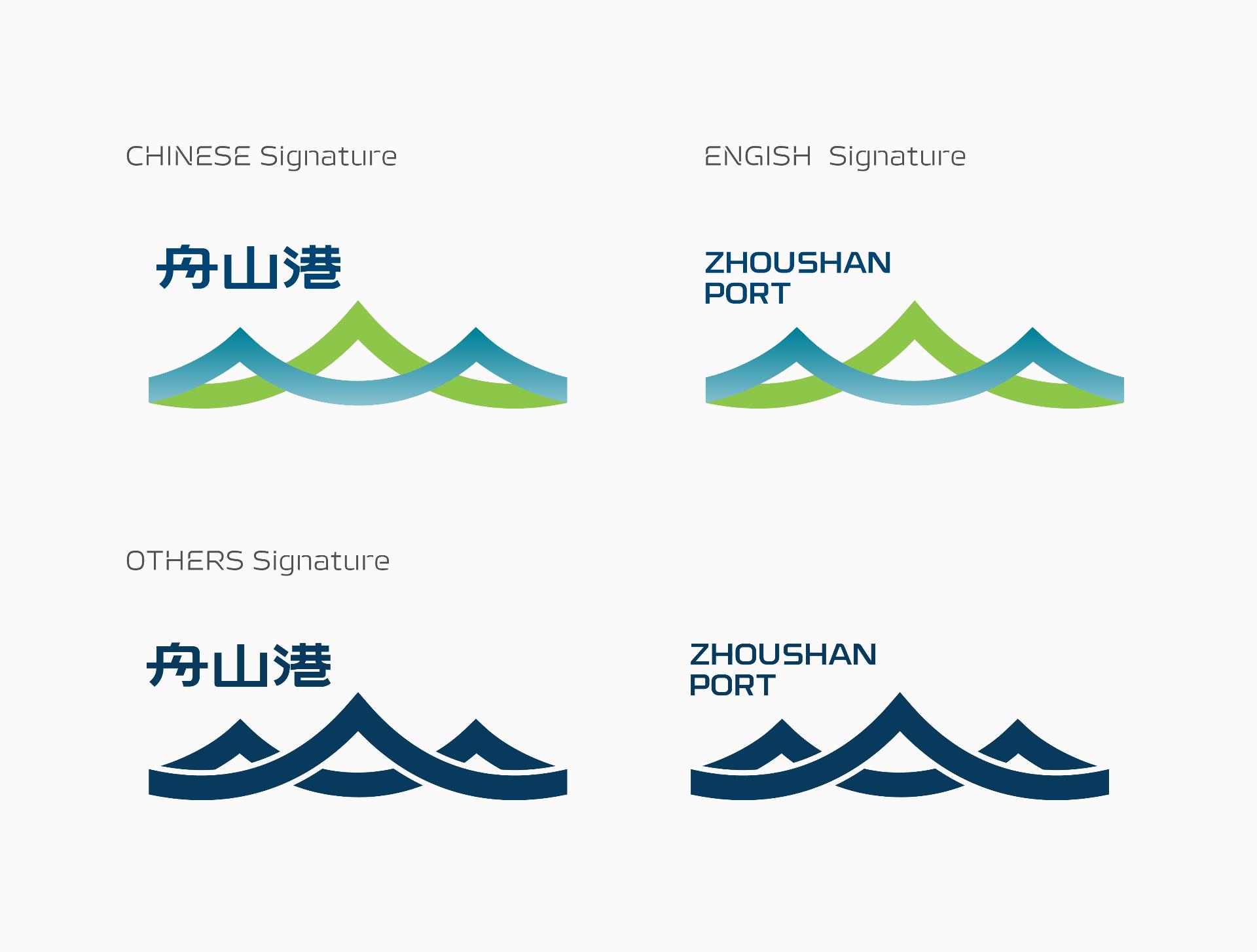
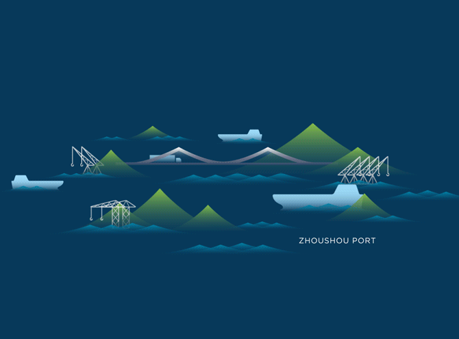
舟山港是群岛形态,港口散点分部在各个岛各个区域。多桥梁连接是舟山港陆路运输的特点,同时也成为舟山市很重要的城市印象。舟山普陀山是著名“海南观音像”景观的所在地,从前舟山人祈求海南观音保佑每次的出航平安,回航满载。“莲花”是舟山重要的人文色彩表现。因此,我们提取了“海(行业属性)、山(地形)、桥(城市名片)、人(在地精神)”的视觉元素,标志表现远山近海、群岛大桥,展现出新区和企业发展乘风破浪的态势,展现港航物流链的延伸和整合。

辅助图形及运用
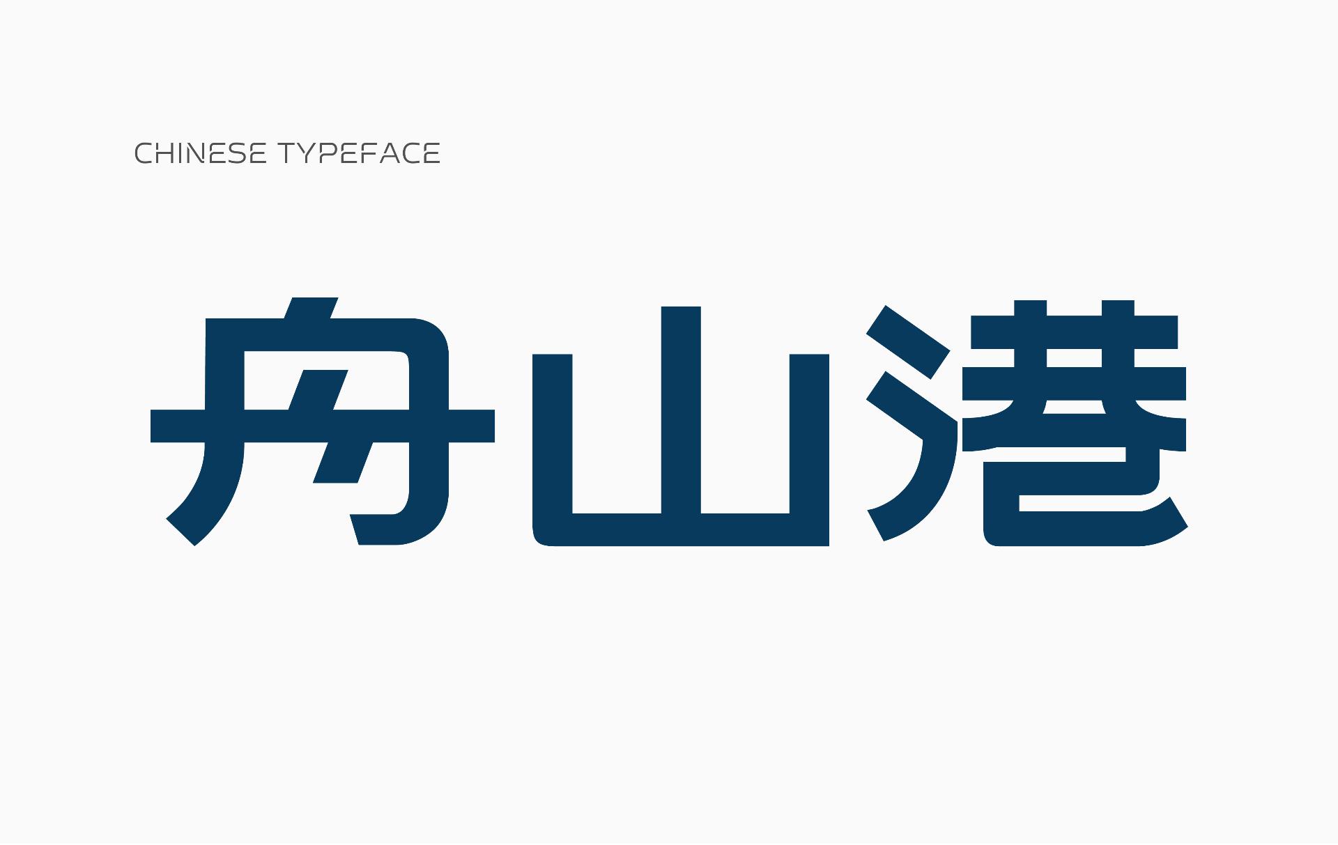
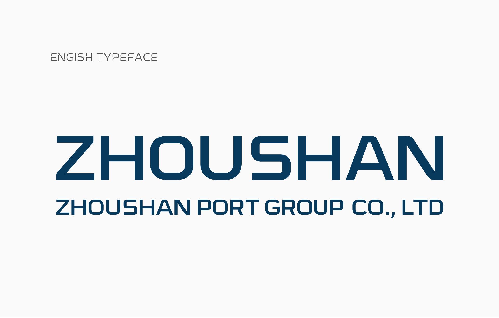
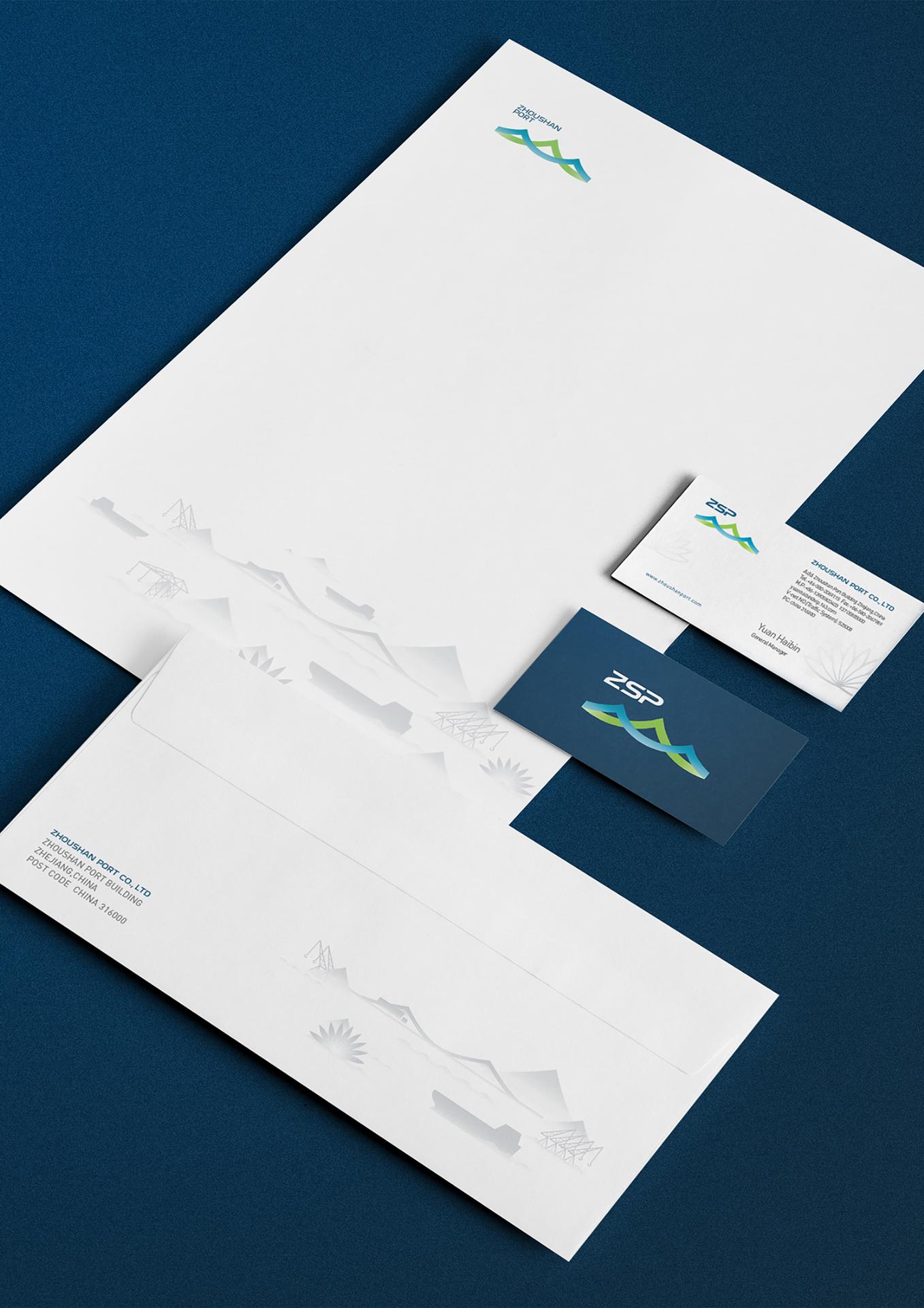
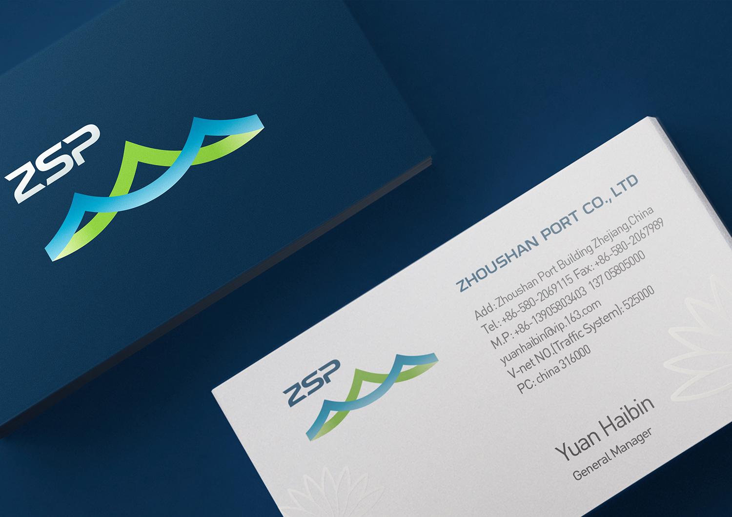
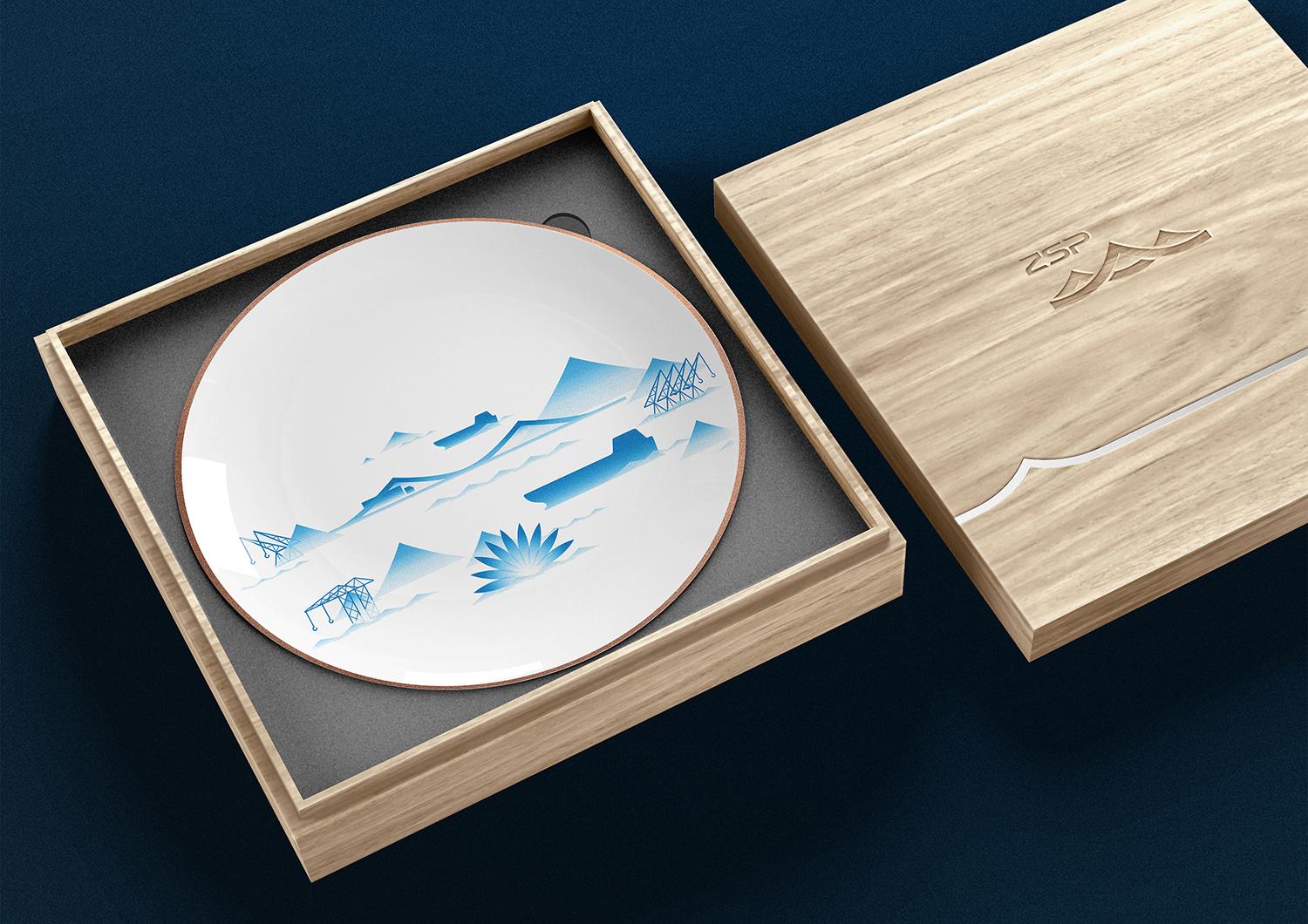
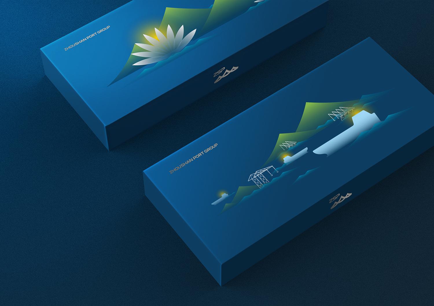
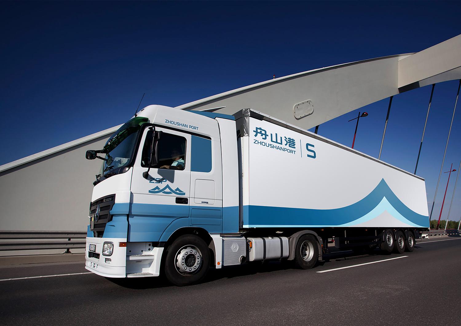
为了更好传递出品牌形象,我们为企业建立了一套辅助图形,以图形山、船、港、桥、莲花表现出地方特色、企业地域特征、资源实力以及人文特色,将其广泛应用于办公事务用品、企业礼品等多方面,令企业形象更饱满,也增加对外传播的故事性。

结果
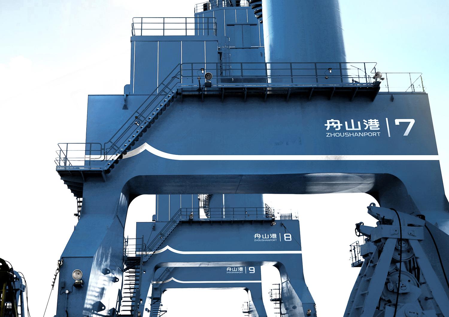
新形象正在投入使用,集团与子公司正在有序更新各方面内容。舟山港独特而完善的视觉语言会逐步建立,对外展示出一个国际企业实力与人文包容并蓄的品牌形象。
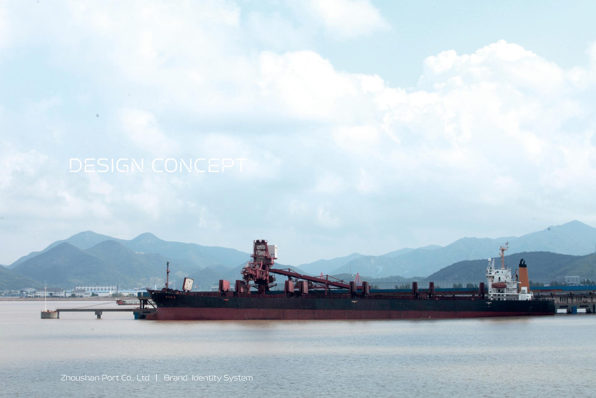
ZHOUSHAN PORT
Brand Background
Zhoushan Port Co., Ltd. is a state-owned enterprise located in Zhoushan, Zhejiang. As the leading enterprise in the area, the company plays a critical role in the economic development and international promotion of Zhoushan City. Moreover, as the international maritime hub in Eastern China and an integral link of the Shanghai-Ningbo-Zhoushan cargo-handling center, Zhoushan Port Co. Ltd oversees port operations as its core business, with supporting arms in shipping services, logistic supply chain services, and business development, emerging on the world’s stage as a state-of-the-art integrated port logistics service provider.
Branding Objective
The Zhoushan Islands is a state-level new district that is now officially included in China’s Twelfth Five-Year Plan. It aims to become a first-class international port city that supports and promotes the Yangtze river basin’s economic growth, and as such, Zhoushan Port now faces a significant opportunity and substantial challenge. The company must now reorient itself from satisfying domestic shipping demand to contend with the globalized market competition, and Zhoushan Port’s new corporate image must concurrently represent the city and possess the qualities of a global brand.
Challenge
As the largest state-owned enterprise in Zhoushan, Zhoushan Port’s brand image is also the calling card of the city. The biggest challenge stems from imbuing corporate brand with Zhoushan’s local identity and traits.
Solution
Zhoushan lies on an archipelago where its ports are scattered around in different districts on different islands. Its newly completed Liuheng Expressway is 31.12km long and a major infrastructure project that bridges Zhoushan’s transportation network, and enables the city to become a major logistics hub in the international market. For Zhoushan Port’s new brand image, we drew visual elements from its mountains, waters, people, and bridges, and abstracted them to represent Zhoushan’s natural geographical beauty: its mountainous backdrop (green), oceanic foreground (blue), its entourage of islands, its newly developed districts, as well as the company’s valor to sail into the wind. We also embedded the element of “Connectivity” into the design, symbolizing the expansion and integration of Zhoushan Port’s logistic supply chain, and representing the company’s seamless and efficient logistic services. Together, they boldly display the company’s determination to forge a major international logistics hub, and deftly unite the signature traits of Zhoushan city with Zhoushan Port’s corporate brand.
In addition, we created a set of supporting graphics to better communicate the corporate brand values. Using simple, distinctive shapes of mountain, ship, port, bridge, and lotus, the shapes represent the signature traits, geographical features, formidable resources, and cultural heritage of the area. These supporting graphics are widely used on office supplies, corporate packaging, and more, helping build a wholesome corporate image and enrich the brand narrative in marketing and communications.
Result
The new brand image is being implemented as we speak: the group and its subsidiaries are updating their brands accordingly. Zhoushan Port will build on its unique and comprehensive visual language, to exhibit both the qualities of a formidable international enterprise and a deeply human acquiescence that are embodied by its corporate image.