覔书店是一个全新的城市人文体验书店品牌,它是集阅读文化、文创产品、主题咖啡、儿童成长与讲座交流的生活文化空间。从零开始,靳刘高设计为客户创意命名,确立品牌定位,设计整体视觉形象,以至空间规划与设计落地,全方位的打造品牌体验。从2014年至今已完全设计4间,落成营运的有3间。
面对的挑战
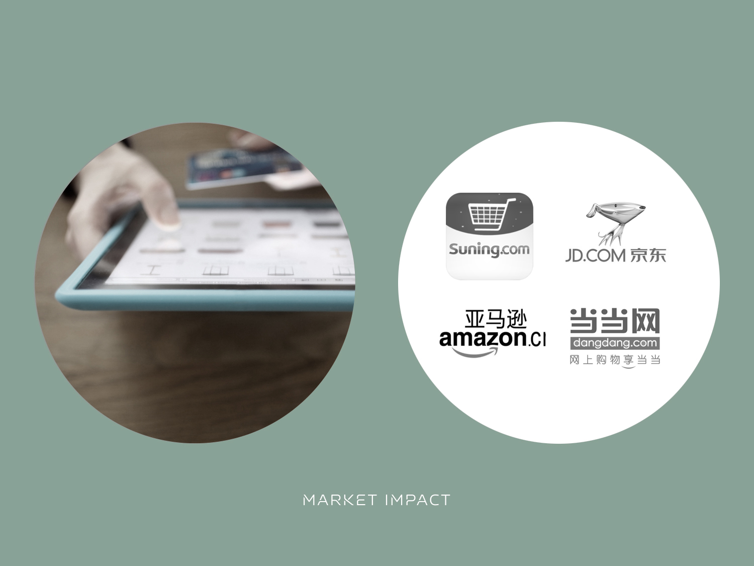
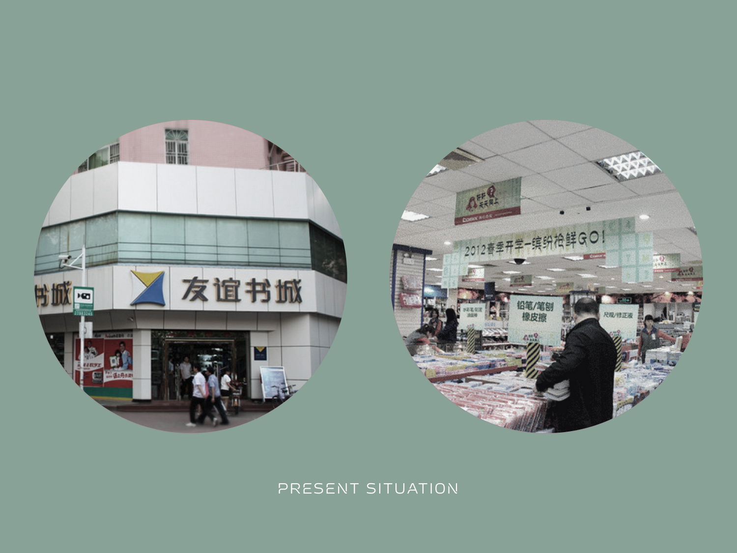
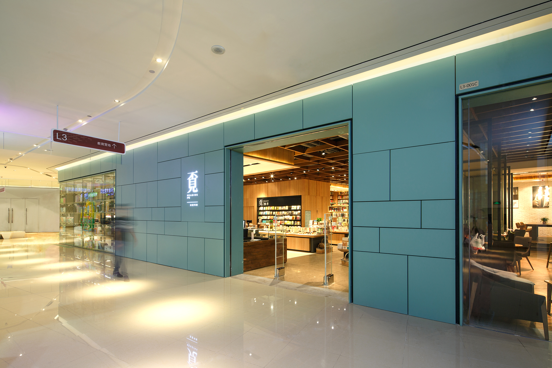
客户方“友谊书城”是深圳规模最大的民营连锁书城品牌,但在当下移动互联时代,电商平台迅速抢占实体书店用户资源,传统书店经营面临极大的挑战。另一方面,以社区为中心的城市综合体越来越多,城市人亦需要一个可以读书的空间,一个休憩心灵的场所,书店需要全方位升级为客户创造更好的生活体验,更好地平衡人文与商业的关系。“友谊书城”找到我们的时候,正在考虑进驻周边拥有30万人口的深圳龙华九方购物中心,以“生活社区、小康家庭、中产阶层”的商业定位,希望为城市家庭提供了一个新型文化概念书店品牌。
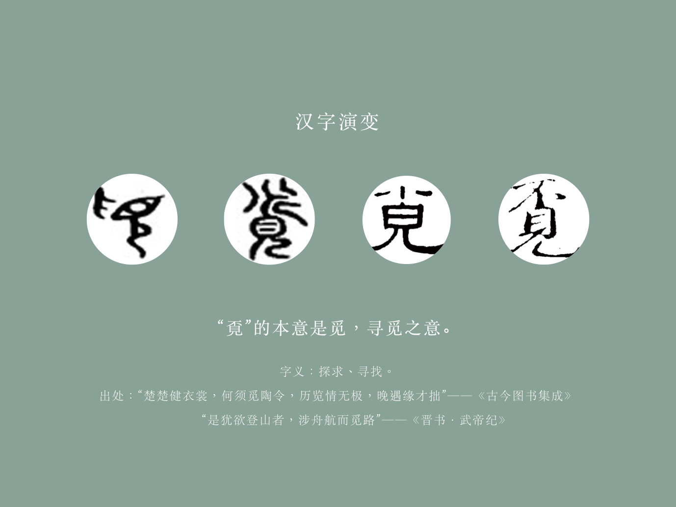
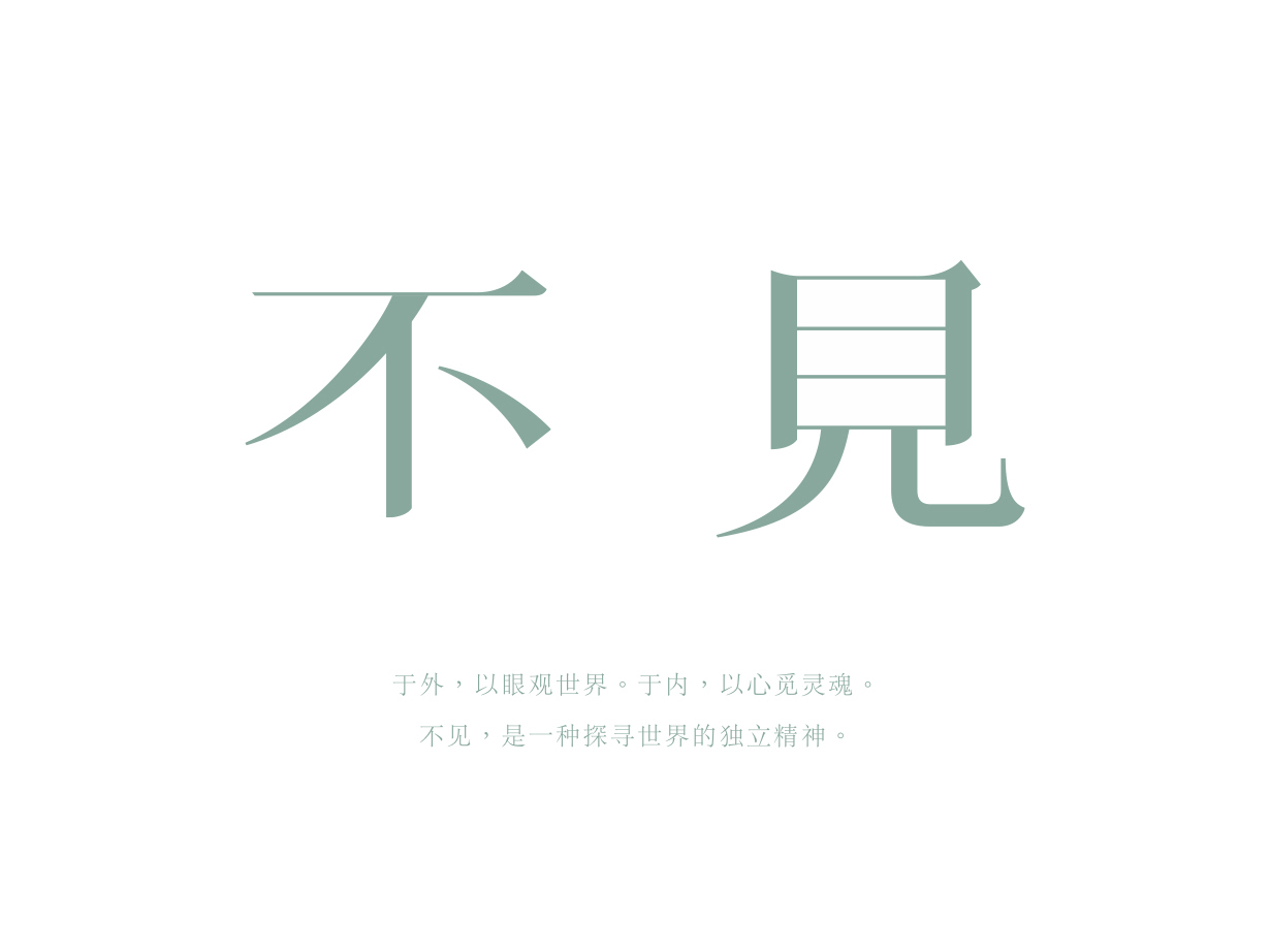
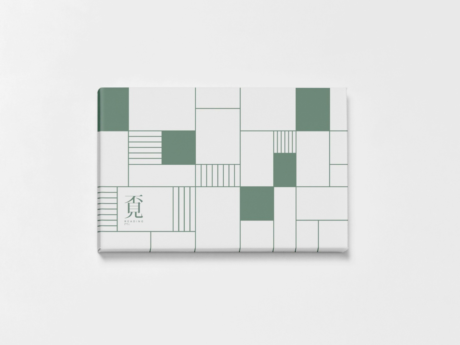
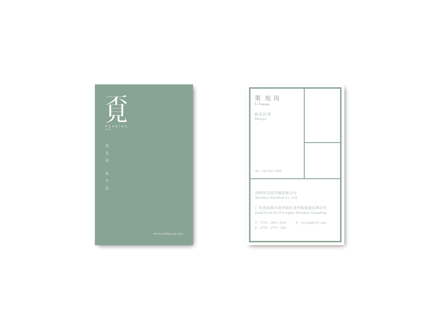
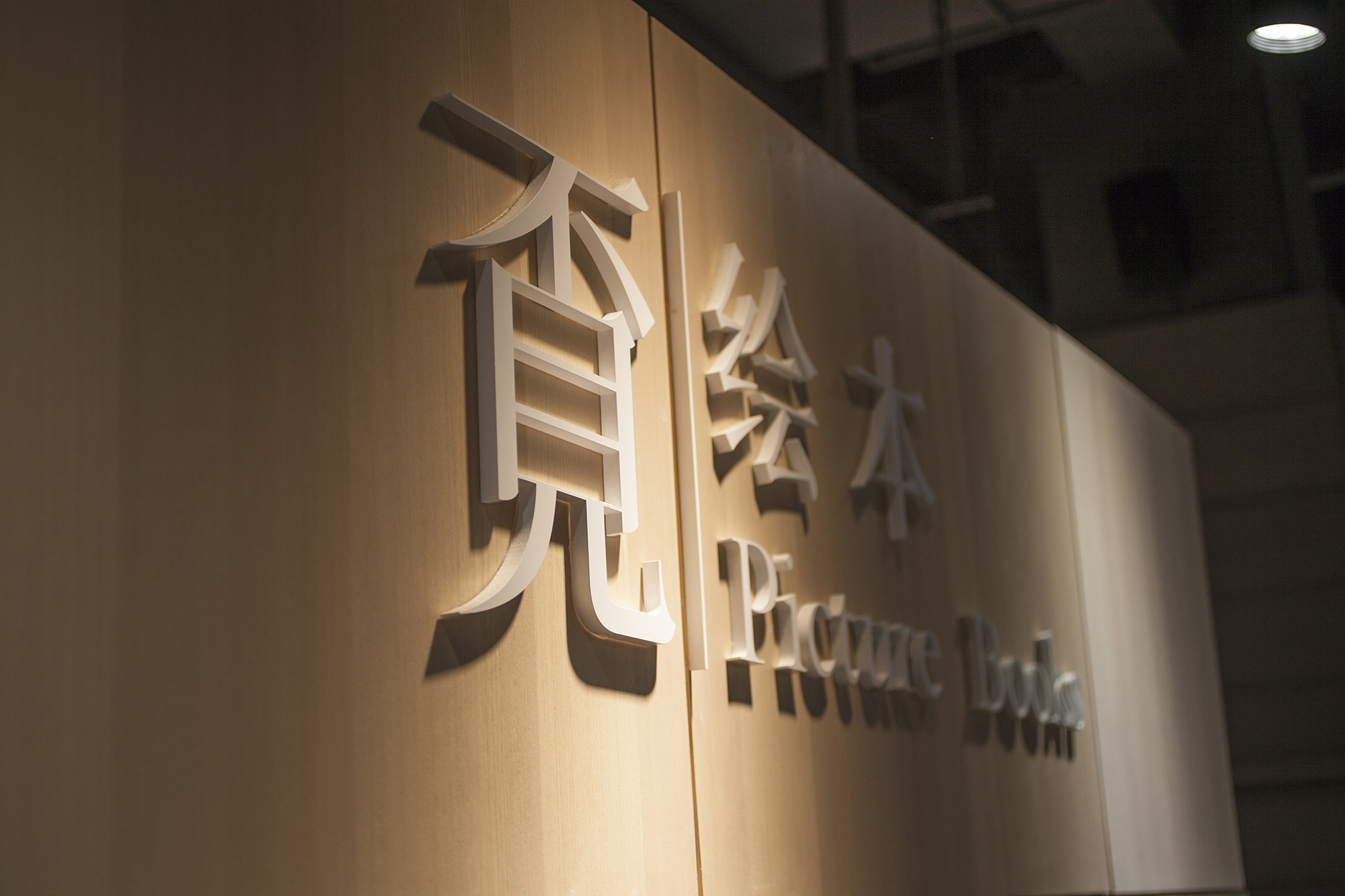
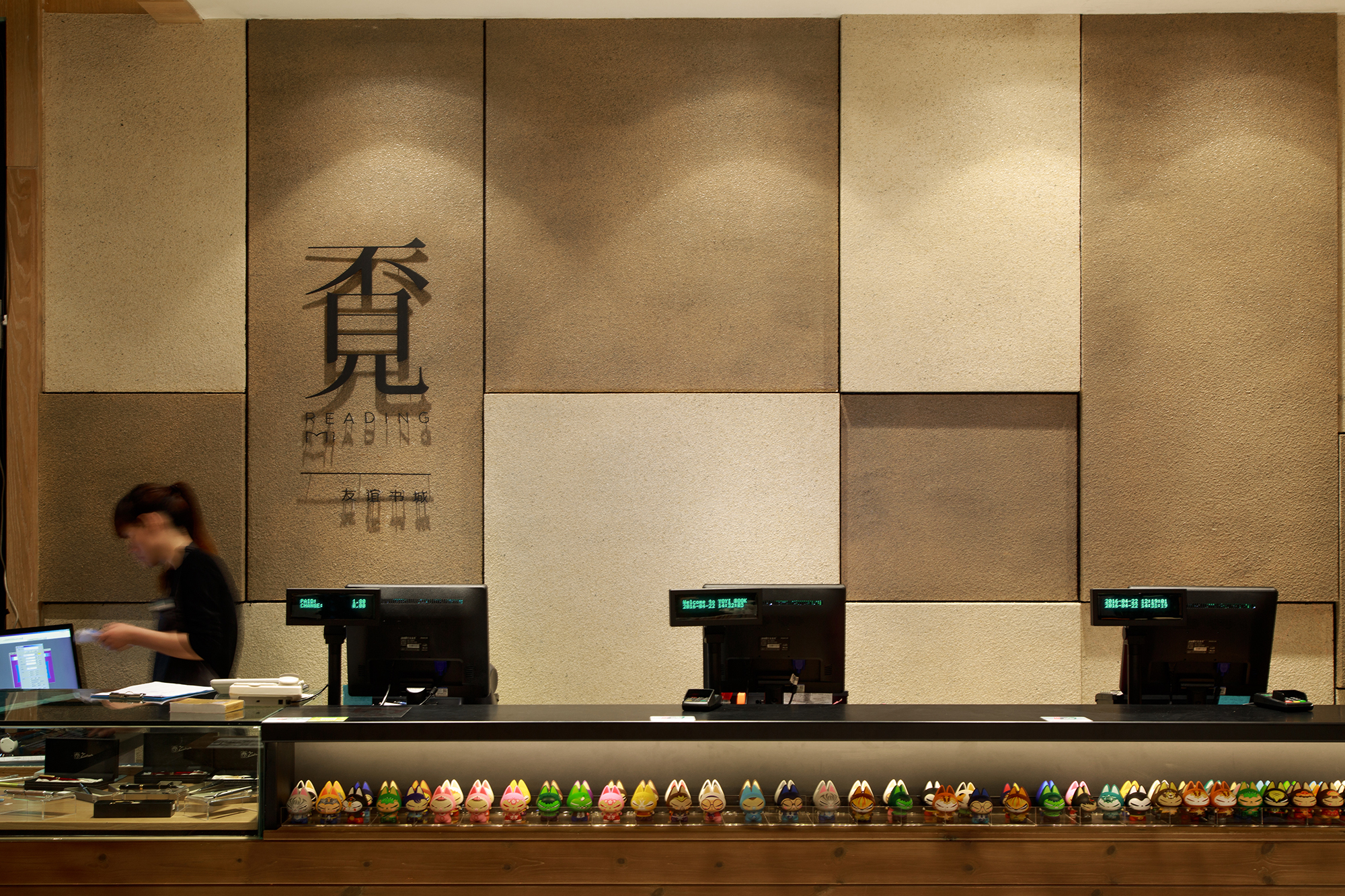
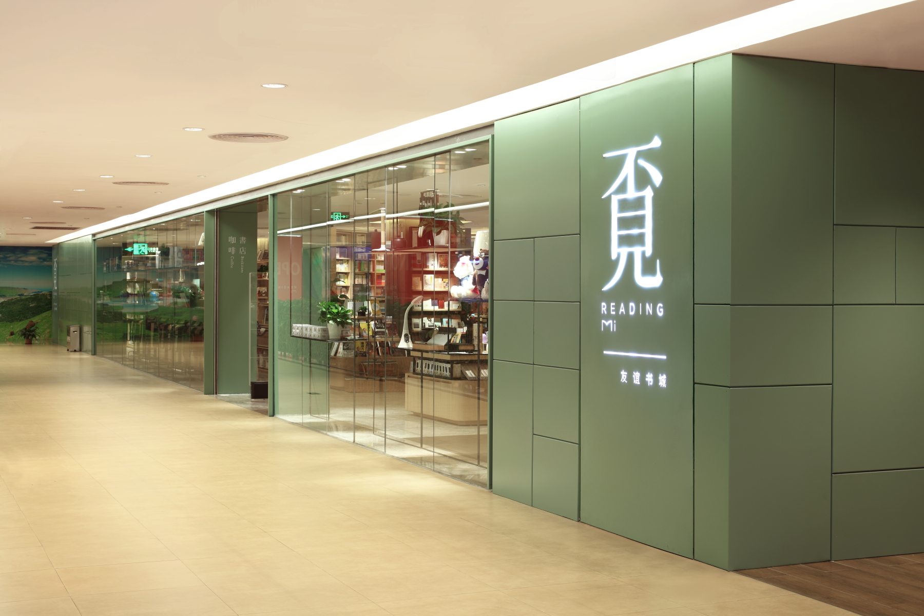
我们提出的新品牌命名为“覔书店 READING MI”。“覔”通古文“觅”,有探求、寻觅之意,契合当下书店文化气质,也表达当下消费人群独特的态度和自由精神。很多人会分拆覔字念作“不见书店”,其实亦是有意思的特色:人之所以寻觅,是因为有所不见。好的命名,能产生传播话题性,又能激发想像。形象设计简洁大方,表现出书店的独特文化气息。

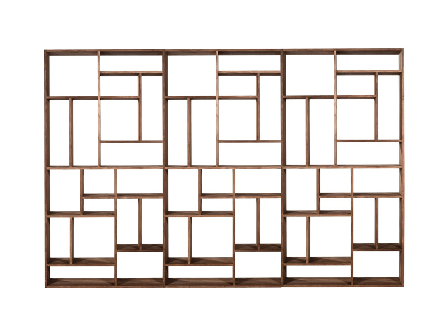


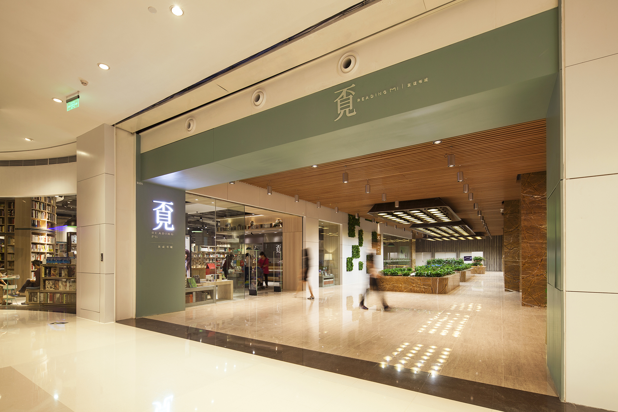
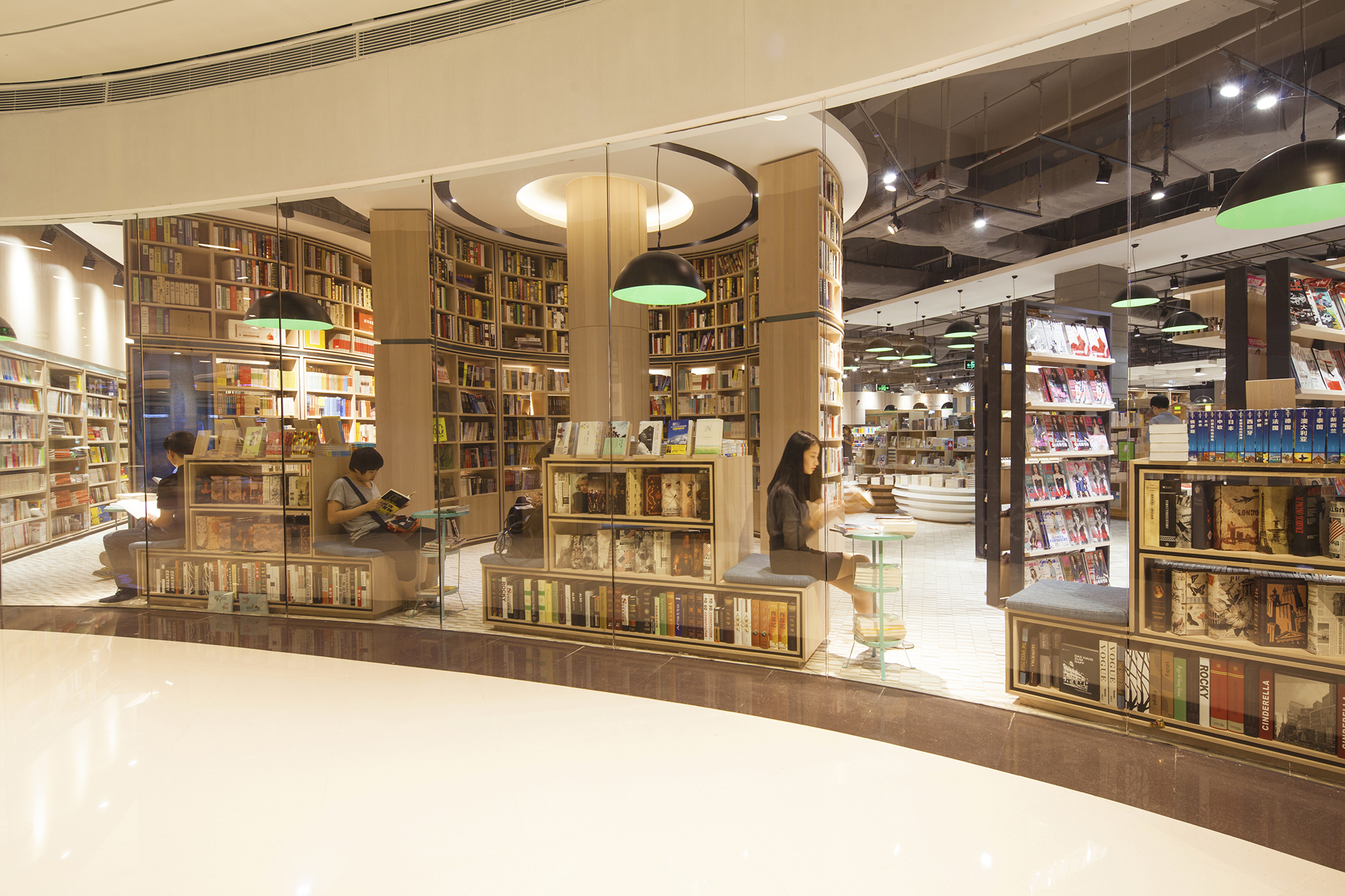
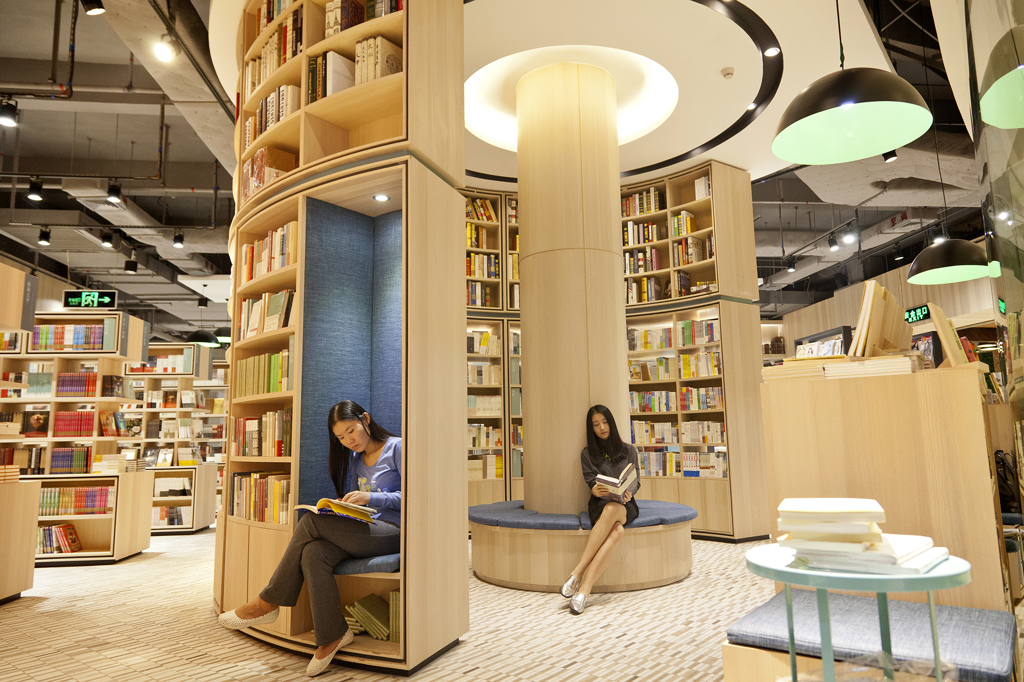
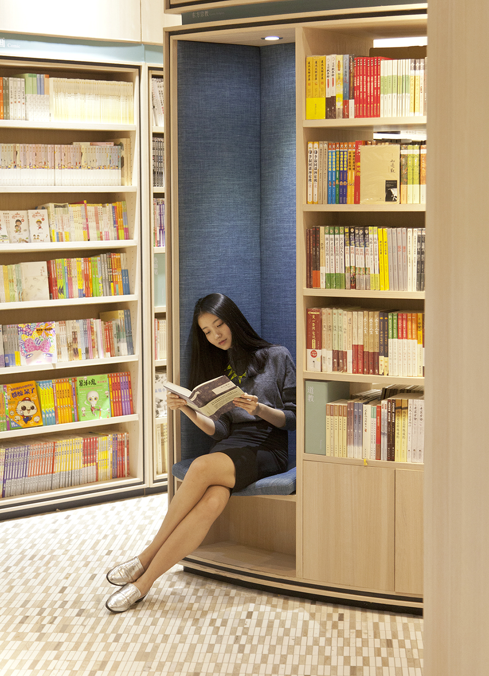
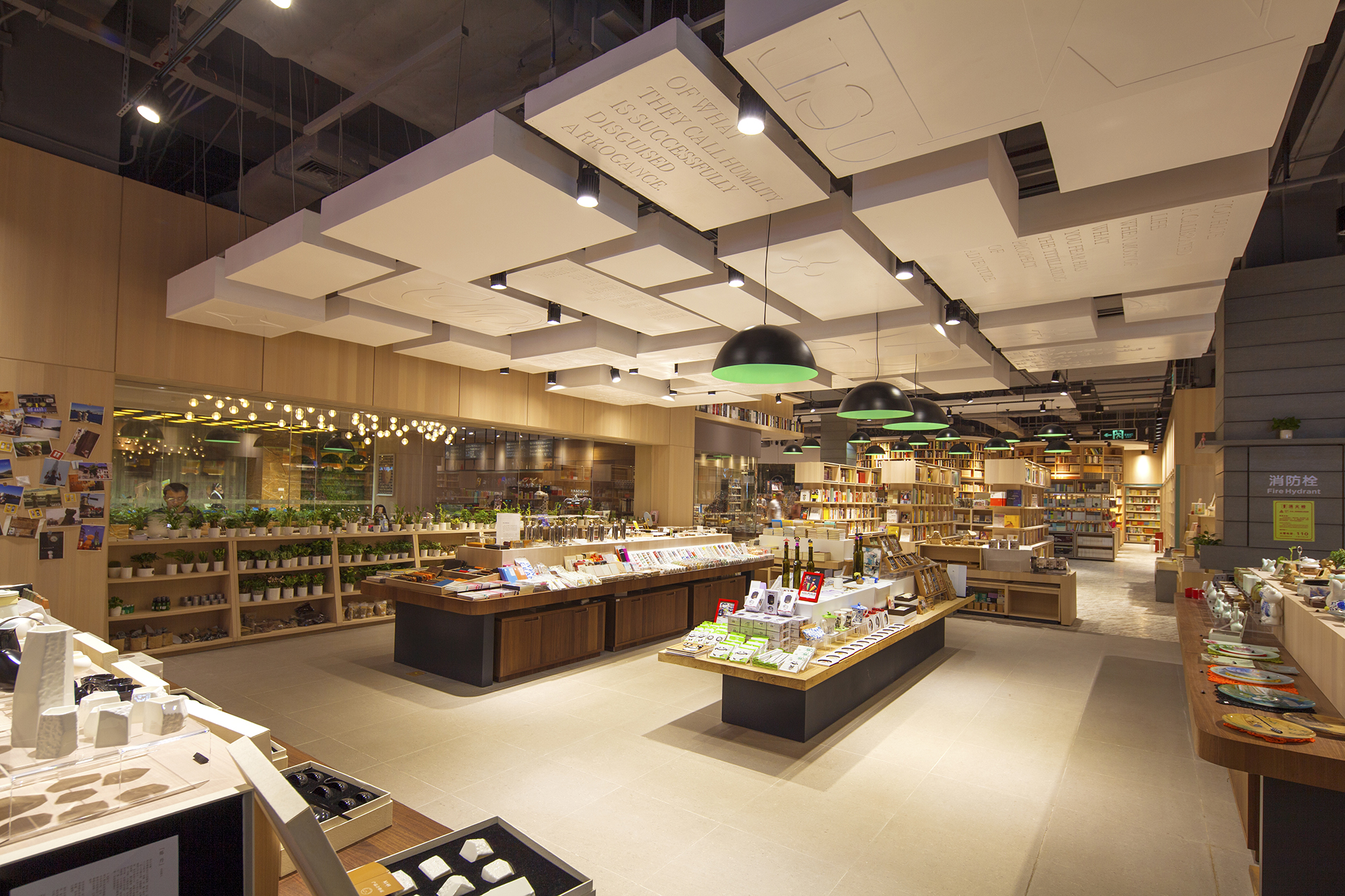
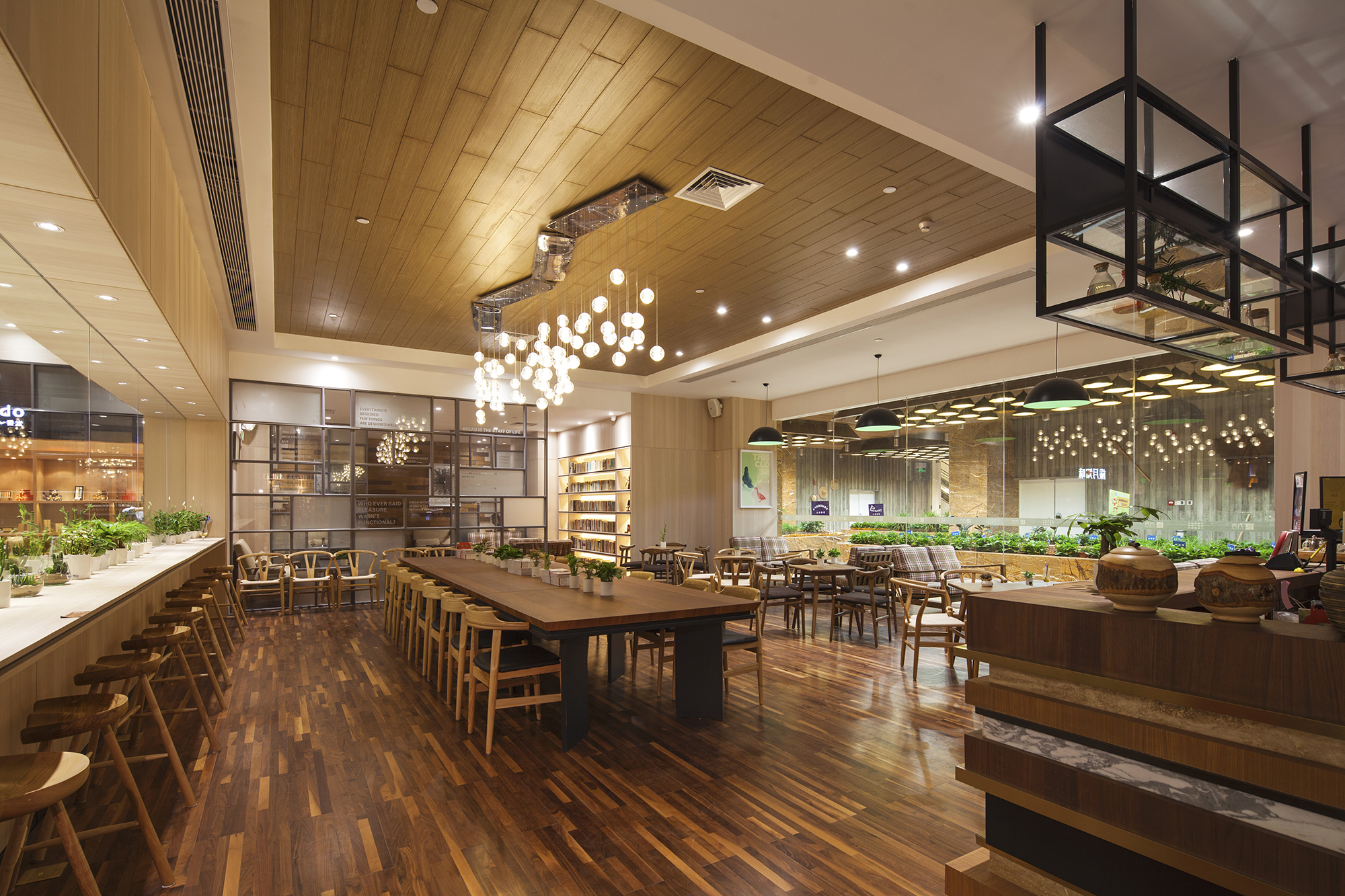
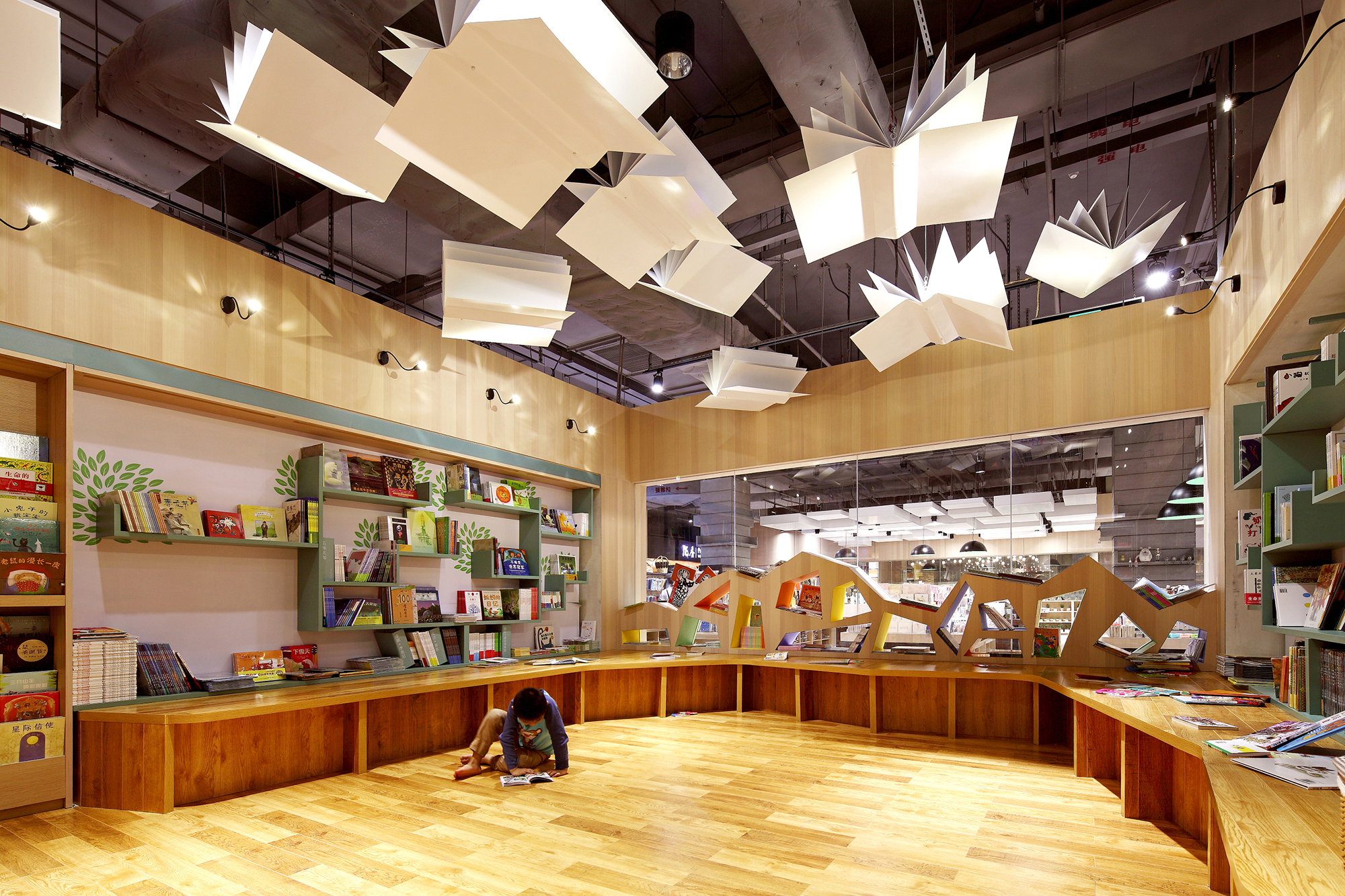
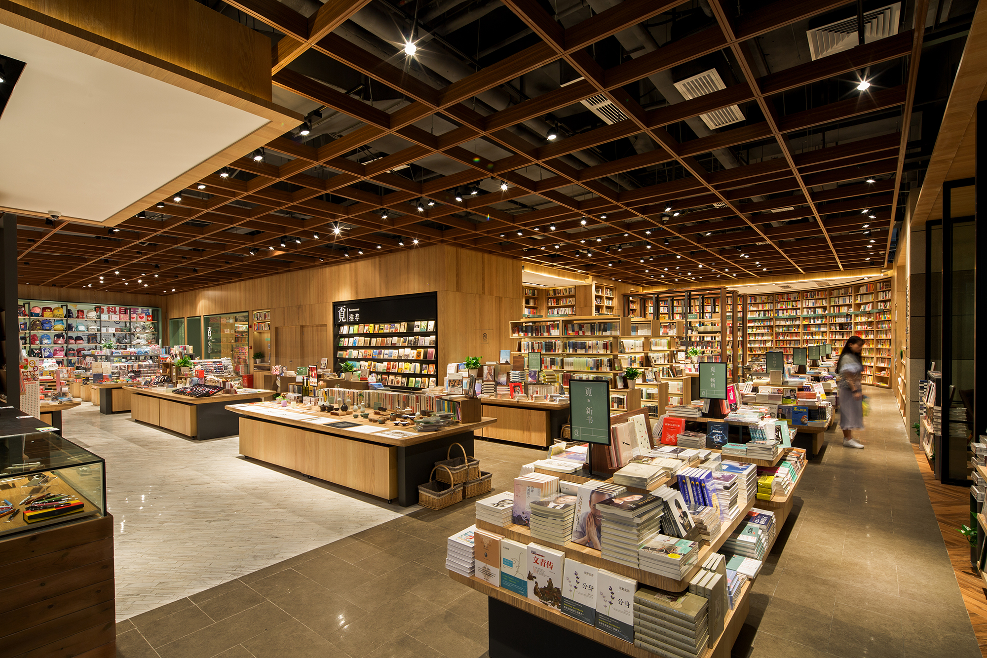
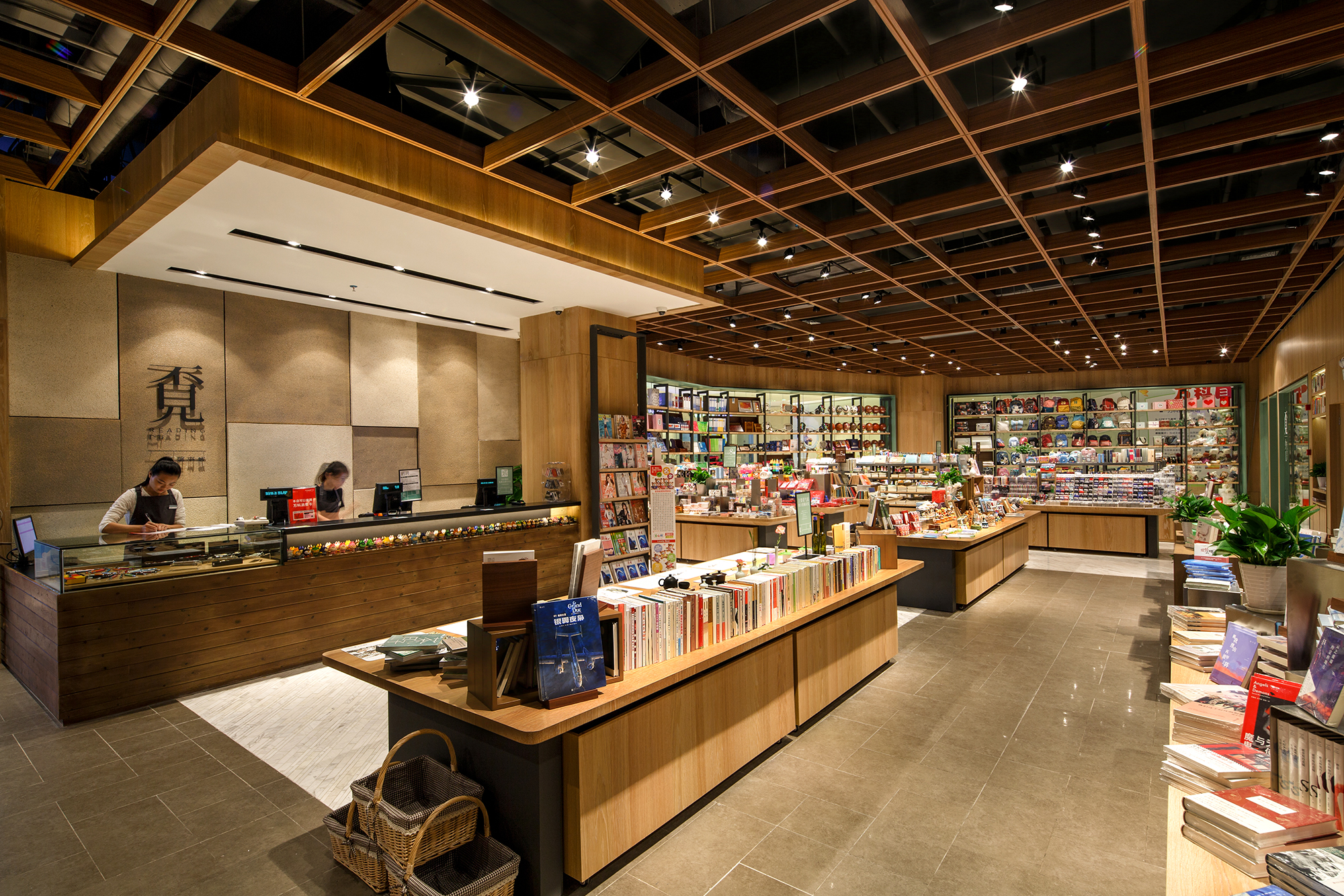
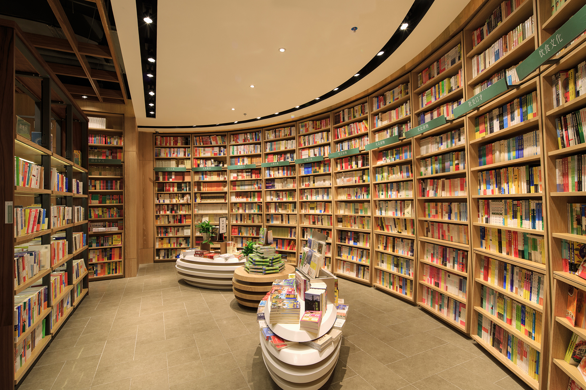
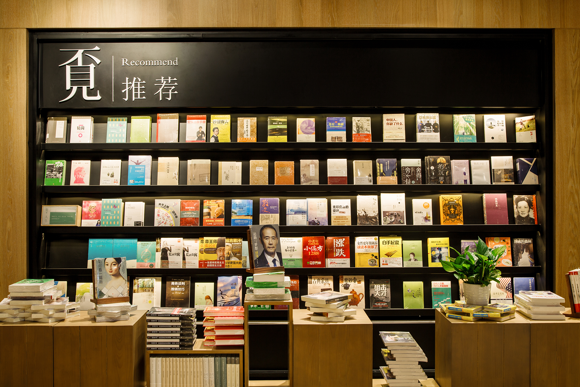
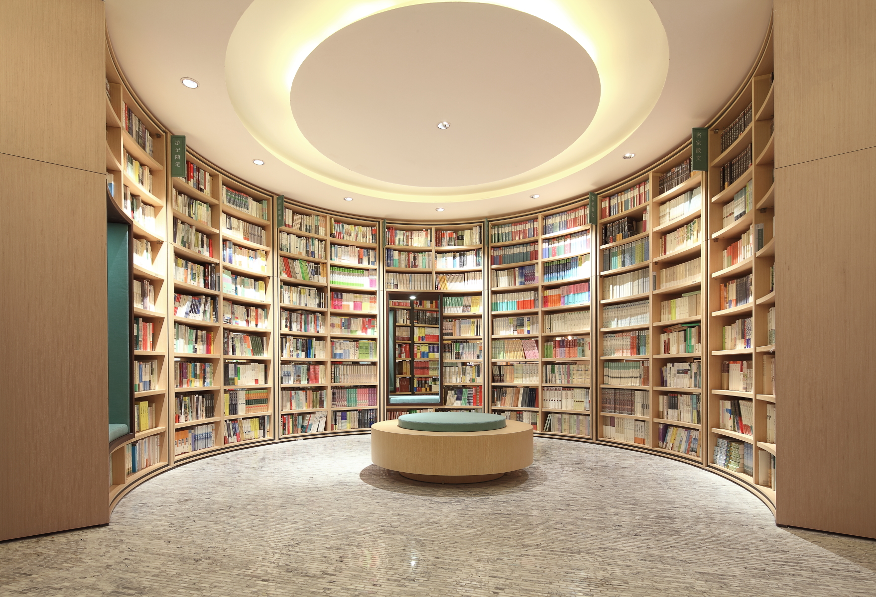
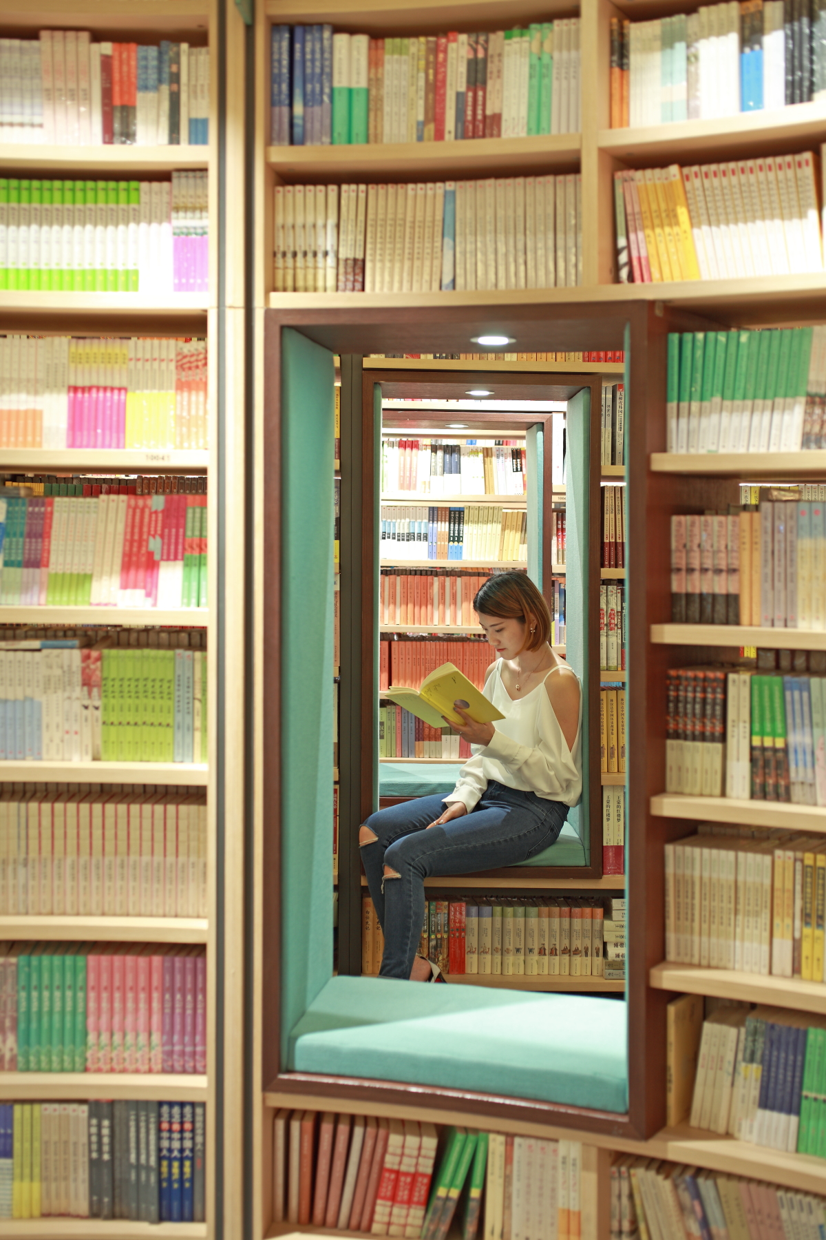
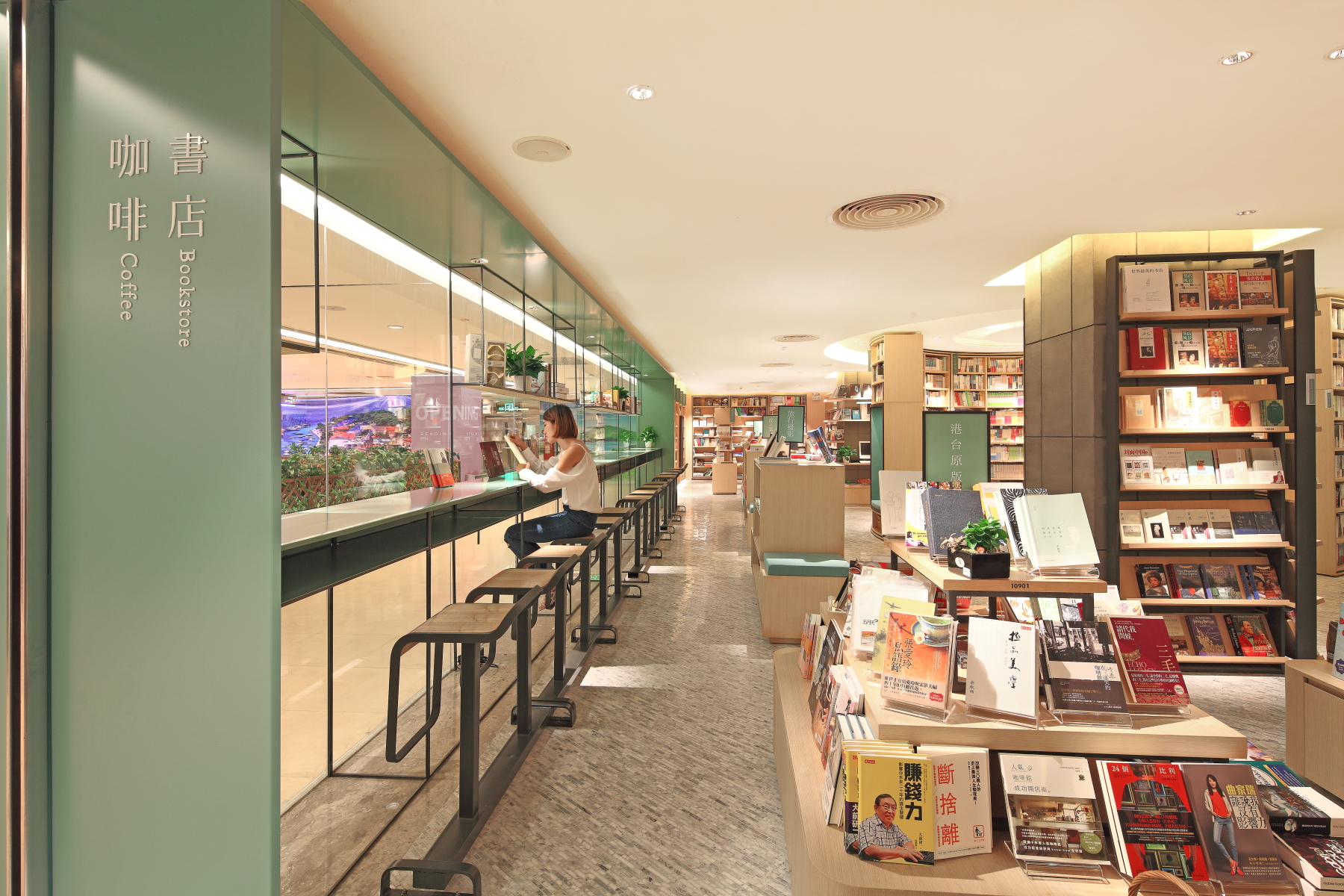
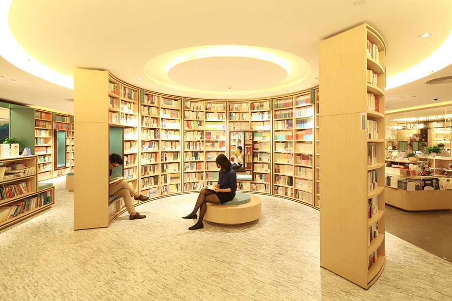
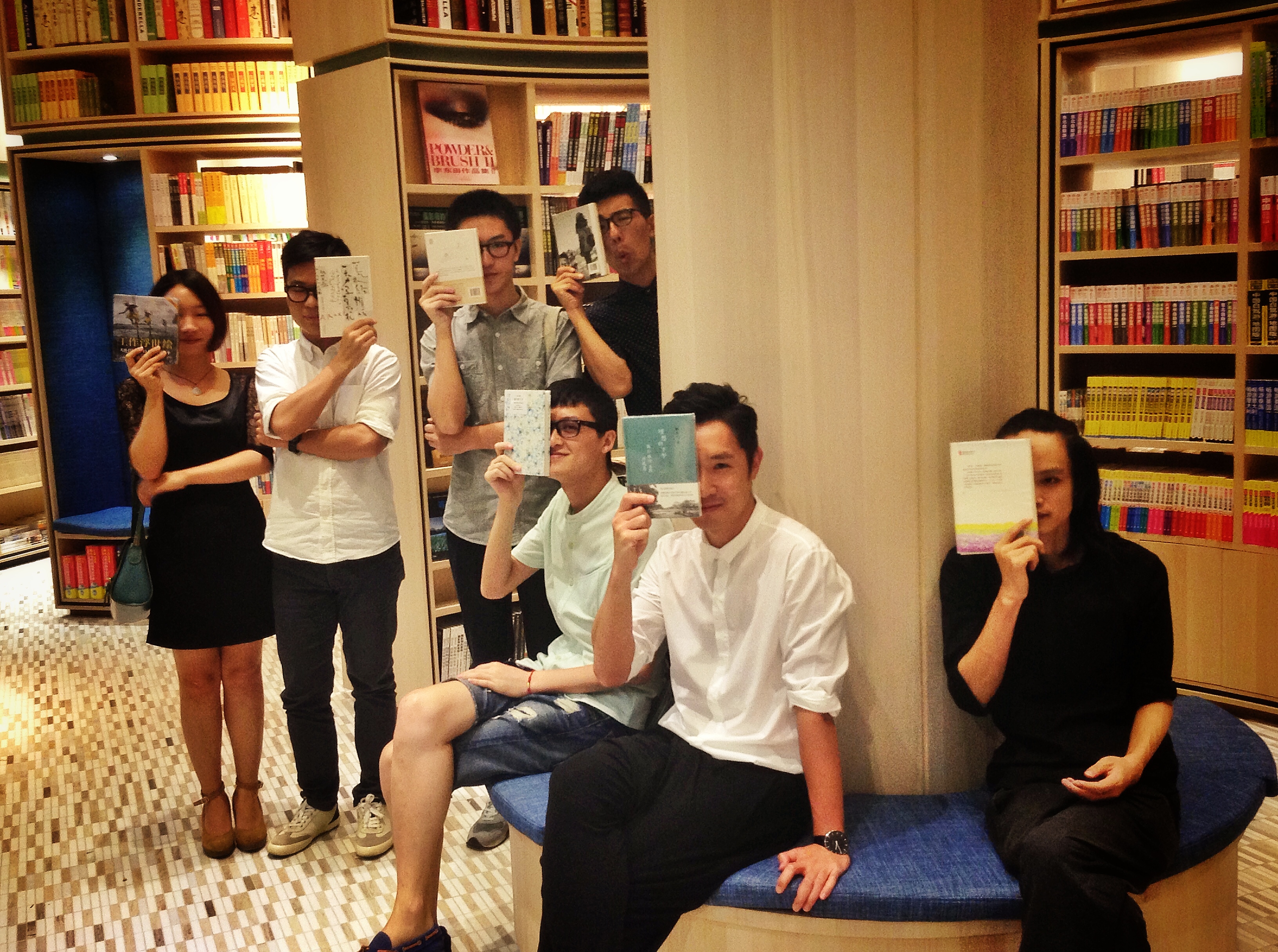
覔书店首次亮相于深圳的九方购物中心,面积约1000平米,是一个综合型销售与体验空间,店内分为图书区、咖啡区、文创区和绘本馆,每个区域以不同的产品陈列方法创造差异化的顾客体验。在设计过程中,我们希望空间中有一些品牌的DNA,可以看到入口处的环形高架图书,创意来源于大英博物馆的环形书架,书架内设置了软包座椅,传递的是一种“人书合一”“书海拥怀”的人文理念,亦是一个热门的自拍位置。
深圳九方店
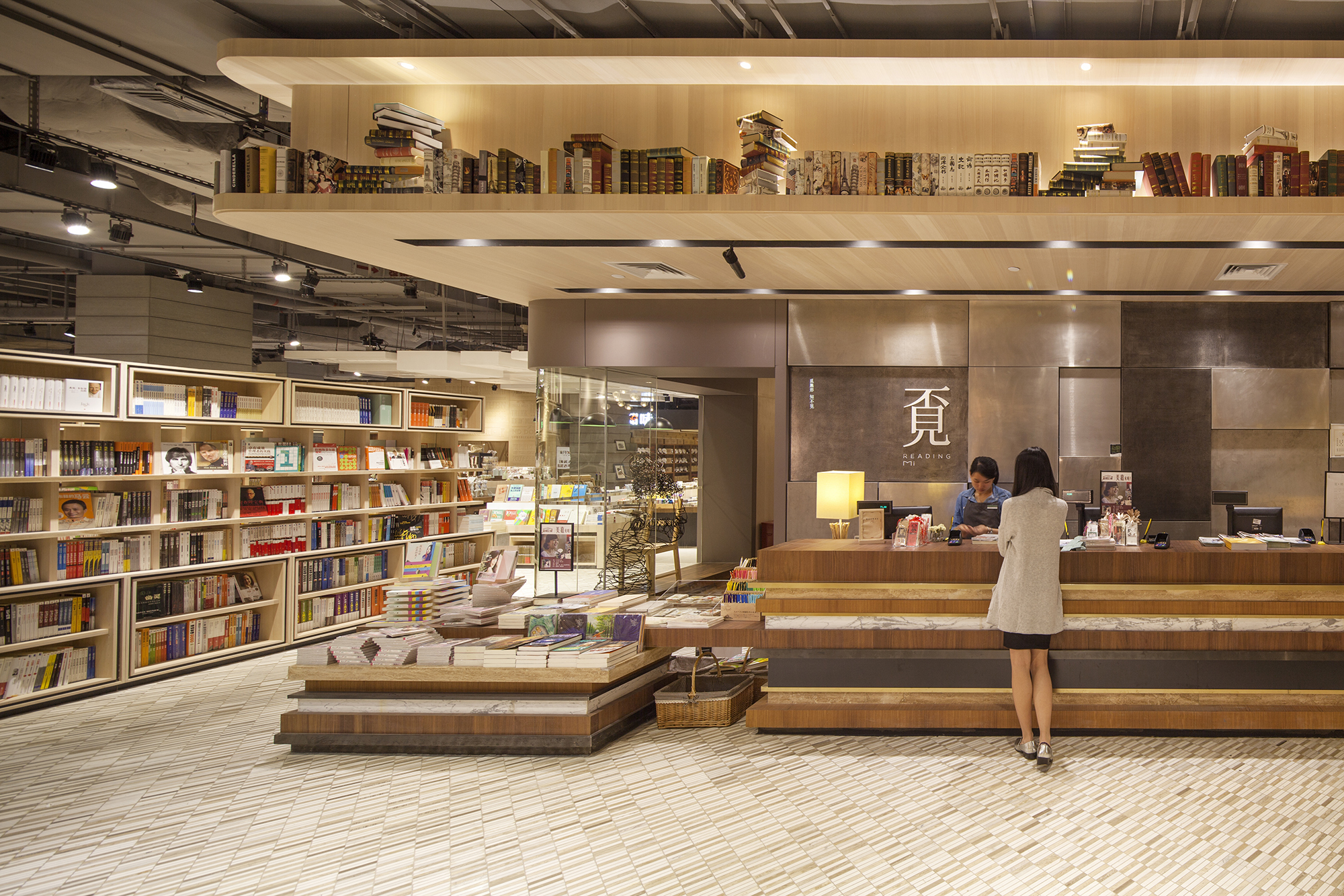
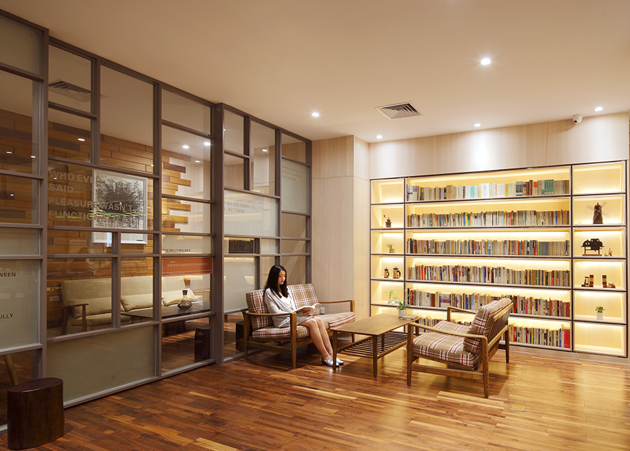
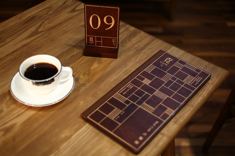
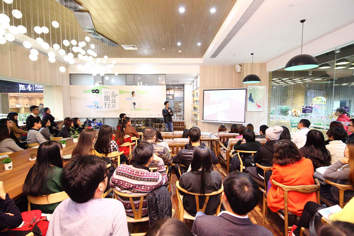
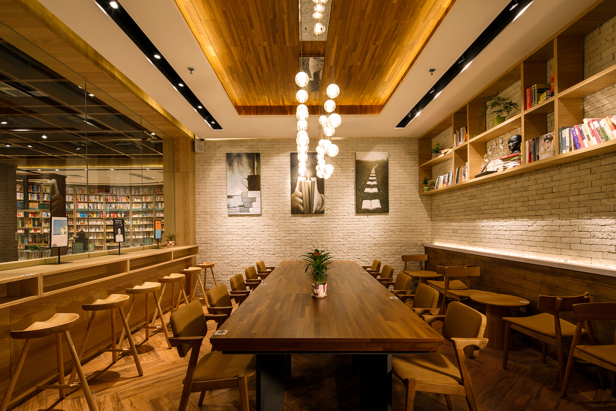
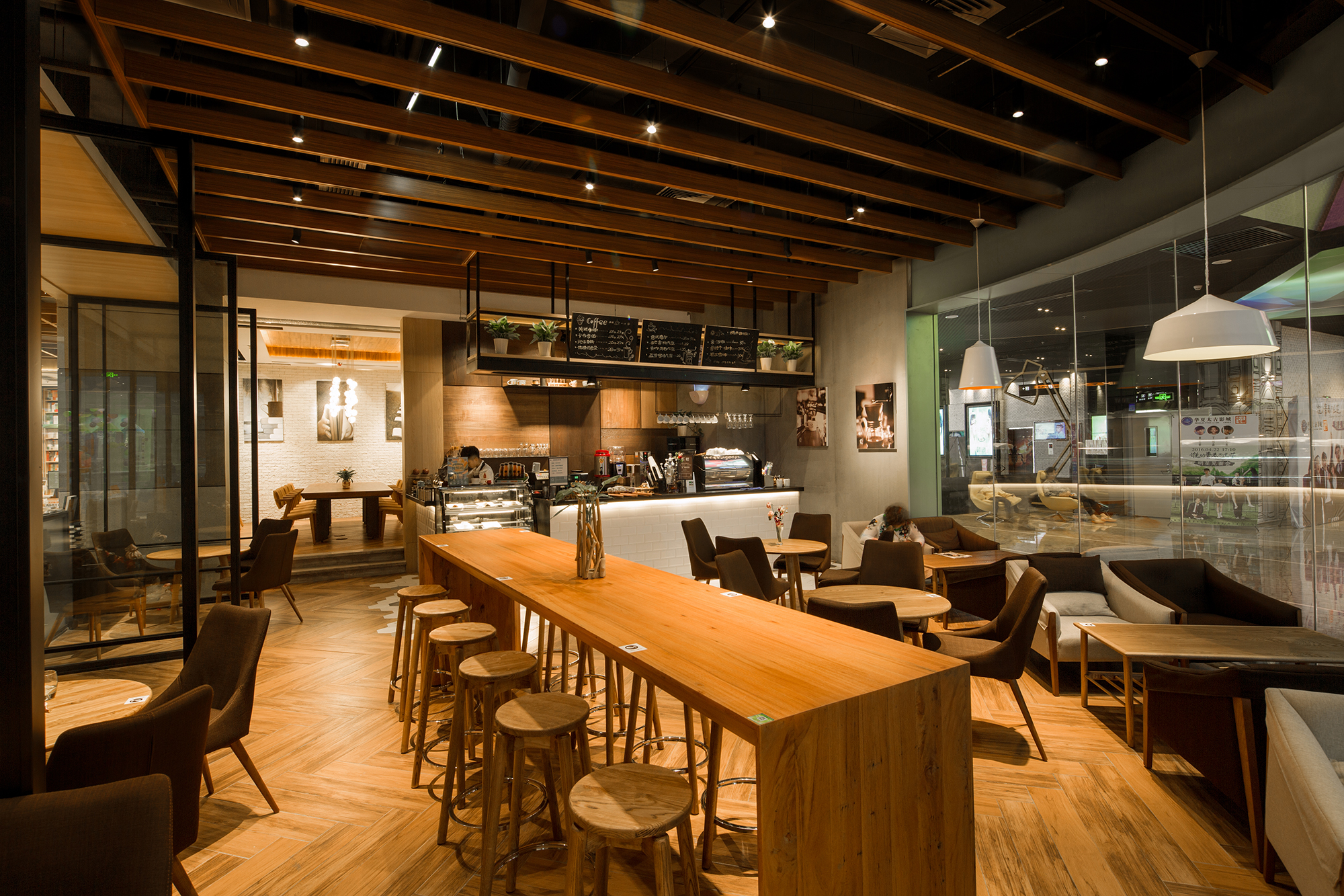
在陈列开放的文创产品区另一侧是“覔咖啡”,是出一个书吧休闲体验区,亦是一个可以搞小型工作坊与讲座的空间。
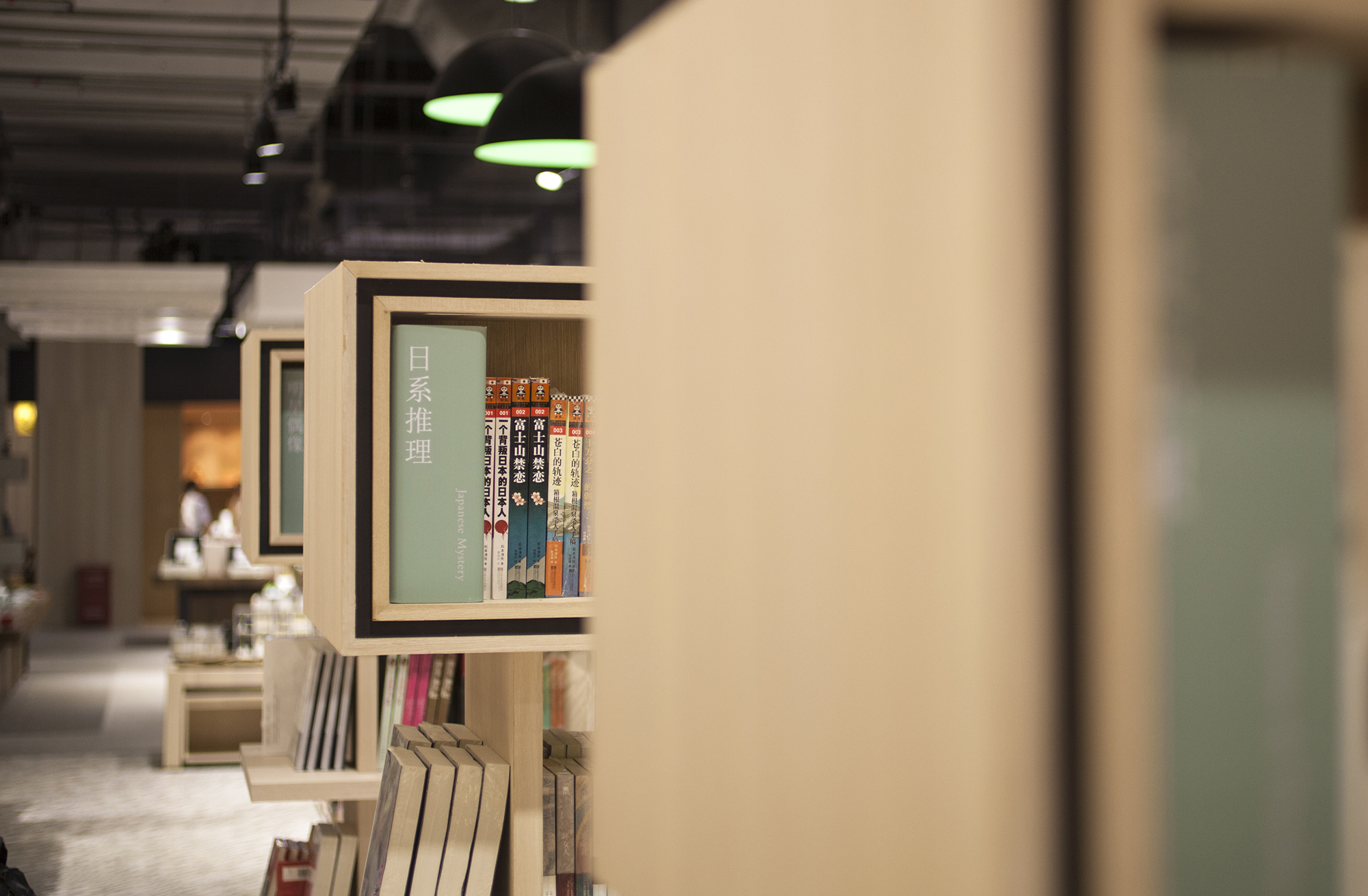
儿童绘本馆在书店的较深处,给儿童一个充满想像力的阅读空间,让家长与儿子可以共待静好的时光。
整个空间呈现出简约时尚的风格,细节讲究协调而精致。城市人口都极需要心灵的休憩空间,覔书店以一种清新的品牌体验与感知,在开业不到一年的时间,以其简约精致的风格迅速活跃在微博、知乎、微信等社交媒体之上,并上榜“十大最美书店”。后继的开店在统一SI的规范下亦作迭代演变,系统越趋成熟。
东莞厚街店
东莞君尚店
2015年覔书店对外发布品牌及终端形象后,在国际国内大赛及媒体中备受关注。
2015A&D Trophy Awards :商业类空间设计优秀奖
2015金点设计奖:金点设计奖- 空间类
2015最成功设计奖:最成功设计大奖- 空间类
2015中国之星:空间类入围奖
第二届中国设计大展:终审作品
媒体:INDESINGNL LIVE
媒体:界面
Reading Mi
Given the convenience and growing popularity of e-readers, physical bookstores doubtlessly have to do more to draw in the customer.
Located in 9 Square, a shopping mall in Shenzhen, China, Reading Mi is a lifestyle bookstore and concept store that aims to capture the huge market of 300,000 residences situated in the new and developing Long Hau District.
At Reading Mi, visitors can spend their leisure time pouring over books, but also shop for cultural design products, have coffee, and participate in workshops and seminars.
“The brand in Chinese is pronounced as ‘Mi’, which literally means ‘to search’. It is an ancient word so not many people know how to read it, and many would see it as a combined word of ‘不’ & ‘見’, which reads as ‘not seen’. So it is this ambiguity that makes up the magic of the brand story: since you can’t see the truth, therefore you are searching. Reading Mi [is a place] to search for your inner self. The bookstore is the cultural core, everything [else] spirals around it,” explains Hong Ko, partner atKL&K Design – the firm responsible for creating the project’s total brand experience.
The brand identity is based on the graphic representation of bookshelves. The overall layout of the store therefore neatly follows the linear grid of bookshelves, but as Hong Ko points out, there are also “a lot of [examples] of the witting marriage of graphics and space”, which is a one of the firm’s core strengths.
The bookstore makes up a third of the 994 square metre space, with the remaining areas allocated to a cultural/design product section, a café, and a children’s illustration book house.
A cylindrical floor to ceiling bookshelf with cushioned seating serves as a key focal point in the store. “We call it ‘the man and book united nook’,” says Hong Ko, “It serves as a strong visual DNA as well as a social media ‘photo opportunity’ (which has proven to be quite successful).”
By incorporating multiple retail and lifestyle experiences in a single, cohesive space, Reading Mi has certainly considered all ways to attract the customer of today.
英文转自:INDESIGNLIVE HonGKONG ——“PUTTING THE LIFESTYLE IN RETAIL”
http://www.indesignlive.hk/articles/projects/putting-the-lifestyle-in-retail